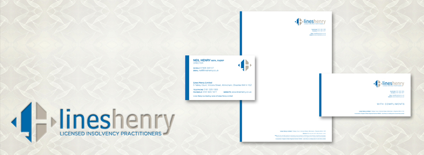
Lines Henry had recently moved offices and urgently required new stationery. I took this opportunity to bring their identity up to date by freshening their existing logo and choosing simpler fonts for the overall design. I worked with the client to choose 2 approved Pantone colours to ensure future consistency of their brand as previously there were no set guidelines for anyone to follow. On approval a full stationery set of letterheads, compliment slips and business cards were litho printed in 2 colour.

