Please take some time to view my portfolio and note that there is a lot of content that I am unable to publish online, so please Get In Touch for further details.
The Russett School
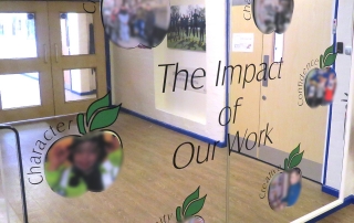
Following a simple sketch of what the school wanted to feature on their wall, I came up with the idea of a mirror to make it more interesting. With safety in mind we used a chrome aluminium composite sheet, faced with printed and laminated vinyl. The size is 2440mm wide x 1900mm high so it had to be created in 2 pieces, and was installed with a matching joining strip and a special painted wooden framed edge. The artwork is based around 6 sliced apples and I setup a template for the school to self-print their own photographs to stick onto the installation whenever required. Faces are intentionally blurred out.
Shadowfoam
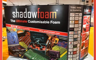
Keeping with the Shadowfoam branding and design I utilised their existing assets and created a Twist exhibition stand which was supplied by my exhibition partner.
This Twist package consists of x4 800mm Twist stands, x1 550mm flexi panel to allow the curve, x2 wheeled cases with graphic panels and black counter tops and x4 LED lights.
If you are interested in Shadowfoam have a look at their website
Loverseed Fitness
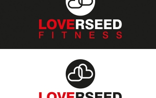
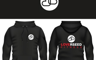
John came to me for a logo for his new personal fitness business. Playing on his surname I immediately realised that if I coloured it correctly it would double up as LOVE FITNESS so it made sense to go with that concept. It’s also not that obvious but the two hearts also symbolise a “J” and an “L” which again is keeping with the theme of fitness and of course John’s surname. Is it all a bit too clever, I don’t know 🙂
Kelly Jackson
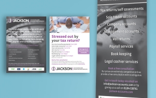
Kelly Jackson required a pullup banner and matching leaflet for an upcoming event. Upon approval I supplied a 1000x2000mm pullup banner with shoulder bag and litho printed 10,000 A5 2 sided leaflets on 170gsm silk.
Castle Metals
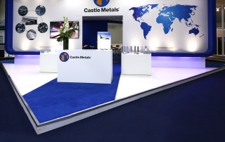
Working with Castle Metals on a revamp of their 2016 exhibition stand is this new beauty. I reconfigured the existing artwork that I created two years ago and worked with an outside exhibition company that built the stand. The whole stand is really impressive and houses 2 meeting rooms at the back with glass and metal fixtures, a screen, display cabinets and LED lighting as some of the features of this build. If you have any project up to this size or greater then please get in touch for more information.
Nail Perfection
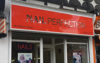
Nail Perfection are simplifying their brand, giving their shop a makeover and updating all of their printing. Starting off with a new logo design I have supplied this lovely white tray sign. All finished of with a red face, chrome fret cut logo with matching chrome address and phone number. The customer has fitted this themselves and done a great job.

